Who is Uswitch?
Welcome to Uswitch.More customers come to us to switch energy, broadband, and mobiles than any other site. Since we launched in September 2000, we’ve helped customers save over £2.7 billion on their bills—and we’re only just getting started.
Read more
We offer clear, expert and impartial guidance so you can make more confident decisions about your home-life essentials and be sure you’re always on the best deal to suit your needs.
And our experts never stop fighting your corner for better, fairer deals so you can switch, save and stay protected.


History of Uswitch
Uswitch has been helping consumers save money on their bills since September 2000, growing to become an established leader in the price comparison website market today.
Originally focusing on energy deals, Uswitch opened up the energy market to competition by offering consumers more choice and better prices.
Working closely with industry regulator Ofgem, Uswitch helped found the Confidence Code in 2002. This code of practice requires UK-based price comparison services to adhere to it in order to be accredited by Ofgem.
We then expanded our offering to customers by adding a mobile phone comparison service in 2001 and a home broadband comparison service in 2005.
In 2018, Red Ventures and the investment firm Silverlake purchased Uswitch from the property giant Zoopla to create RVU, a family of brands of which Uswitch is now a part.
Over the last 25 years, we’ve saved consumers over £2.7 billion.
We put U first
At Uswitch, we put you at the heart of everything we do. So we do more to get you a better deal on your home services. Here's what you can expect from us:
More choice
We think healthy competition is a good thing. That’s why we battle to bring you the best deals, giving you even more control over your bills.
Fairer prices
We speak out against rules that keep your bills high, holding the energy and telecoms regulators to account on your behalf.
Useful services
We help you understand your bills, energy usage and ways to save with our app. Because switching is just the start.
What can you switch with us?
Credit cards
Up to 31 months balance transfers
We’re experts in our field
We take every opportunity to give you the best possible advice, and you’ll often see our energy, broadband and mobile experts quoted in the press, on the radio or even on TV.
Across our site, you’ll find impartial, informative guides and news articles to help you make confident decisions - all written by experts who are passionate about helping you.


Ernest Doku, Uswitch Telecoms expert
As head of Commercial for broadband and mobiles, Ernest has years of experience in the industry and talks all things tech. From new mobile handsets to video games and everything in between, Ernest’s name can often be seen in major titles across the UK and as a contributor to the likes of Mobile News, The Metro, Huffington Post, and Mobile Today.

Richard Neudegg, Uswitch regulatory expert
As Uswitch’s Director of Regulation, Richard is a passionate consumer champion. He ensures customers are empowered to get the best deal possible on their communications, energy, and personal finance bills.

Ben Gallizzi, Uswitch energy expert
Ben is the Senior Editor of all of Uswitch’s Energy content, specialising in home energy use and electric vehicles. Over the last six years, he has shared his vast expertise on BBC Breakfast, LBC News, Bloomberg Radio and various national and regional broadcast outlets.

Sabrina Hoque, Uswitch telecoms expert
As a telecoms expert, Sabrina knows how to find a good deal on broadband. She connects our customers with our providers and offers her expertise in national and regional media.

Elise Melville, Uswitch energy expert
Elise is passionate about demystifying the energy market and helping consumers find the best energy deals for them. Whether this means finding a great price, green energy tariffs, or tracking day-to-day energy usage, Elise is dedicated to creating innovative solutions for consumers.

Max Beckett, Uswitch broadband expert
Max loves all things technology and quickly became Uswitch’s resident expert on everything from broadband to 5G to smart homes. He offers insight and guidance on saving money, handling price rises and knowing your rights as a customer.

Simrat Sharma, Uswitch mobiles expert
Simrat has an interest in all things technology, and as a spokesperson for Uswitch, she offers her in-depth knowledge of the latest mobile products and the best way to save on your mobile bills.
Our spokespeople
When our expertise is required on other sites and in other formats, our team of spokespeople is on hand to offer their expertise and support to customers. They appear in nationwide coverage from national TV spots to local radio and are quoted on news platforms like the BBC and in publications such as The Sun, The Metro, and The Guardian.
Ernest Doku, Uswitch Telecoms expert
As head of Commercial for broadband and mobiles, Ernest has years of experience in the industry and talks all things tech. From new mobile handsets to video games and everything in between, Ernest’s name can often be seen in major titles across the UK and as a contributor to the likes of Mobile News, The Metro, Huffington Post, and Mobile Today.
Richard Neudegg, Uswitch regulatory expert
As Uswitch’s Director of Regulation, Richard is a passionate consumer champion. He ensures customers are empowered to get the best deal possible on their communications, energy, and personal finance bills.
Ben Gallizzi, Uswitch energy expert
Ben is the Senior Editor of all of Uswitch’s Energy content, specialising in home energy use and electric vehicles. Over the last six years, he has shared his vast expertise on BBC Breakfast, LBC News, Bloomberg Radio and various national and regional broadcast outlets.
Sabrina Hoque, Uswitch telecoms expert
As a telecoms expert, Sabrina knows how to find a good deal on broadband. She connects our customers with our providers and offers her expertise in national and regional media.
Elise Melville, Uswitch energy expert
Elise is passionate about demystifying the energy market and helping consumers find the best energy deals for them. Whether this means finding a great price, green energy tariffs, or tracking day-to-day energy usage, Elise is dedicated to creating innovative solutions for consumers.
Max Beckett, Uswitch broadband expert
Max loves all things technology and quickly became Uswitch’s resident expert on everything from broadband to 5G to smart homes. He offers insight and guidance on saving money, handling price rises and knowing your rights as a customer.
Simrat Sharma, Uswitch mobiles expert
Simrat has an interest in all things technology, and as a spokesperson for Uswitch, she offers her in-depth knowledge of the latest mobile products and the best way to save on your mobile bills.
We campaign for change
You might have seen us in the media holding industry and regulators to account. That’s all part of us putting the power back in your hands. Here’s some of the work we’re most proud of:
Cheaper energy deals
When Ofgem decided to retain the Ban on Acquisition-only Tariffs for energy customers recently, keeping your prices higher, naturally we took them to task on it. And we’ll keep fighting your corner until the rules actually benefit you.
End-of-contract notifications
For years, broadband and mobile phone providers were able to raise your prices without warning once your contract ended. Now, after extensive campaigning to Ofcom, that’s all changed. So you’ll never be caught off guard again.
One Touch Switch
Switching broadband offers greater reliability, faster speeds and better value. Uswitch put pressure on Ofcom and telecoms providers to introduce One Touch Switch, a more streamlined process to make it even easier for consumers to get a better deal.
Mid-contract price rises
Every year, mid-contract price rises push up the bills of millions of broadband and mobile customers across the UK.
We’re not afraid to e call out providers and networks to make sure these increases are fair and transparent - and we give our customers all the information they need in order to avoid those annual price hikes.
'Stay put'
When the energy market crashed in 2021, we launched our boldest campaign yet, advising you not to switch until the market stabilised. That’s all changed now – and switching is back. But we’ll never stop giving you the most honest advice.

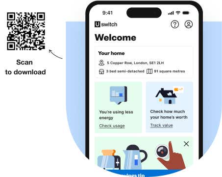
We bring you smart insights about your home with Utrack
When customers were struggling with higher energy prices than most of us have seen in our lifetimes, we did whatever it could to help our customers save money. We developed Utrack, a free app that connects to your smart meter to help you monitor your energy costs and reduce your energy consumption to effectively save you money.
Utrack now offers consumers a whole range of ways to save. It offers a Money Back scheme where users are paid when they reduce their usage at certain times. It offers personalised savings tips based on your usage habits, and also enables you to get cashback when you switch to certain energy deals.
We bring you smart insights about your home
Switching is just the start. Now you can track, save and make smarter choices for your home, in one place, with the Uswitch app.
Answering your questions
Here are some things you might be wondering. Have another question? Just get in touch.
How does Uswitch make money?
At Uswitch, transparency is key. We earn money through commissions paid by service providers when you switch through our site. This does not affect the deals you see and we will always help you find the best options available, regardless of provider.
Our commercial experts are constantly working to get you the best deals in the market, helping you save money and get better service.
This includes securing exclusive broadband and mobile deals for Uswitch customers or getting new and hard-to-find energy deals to our users before any other price comparison website.
Are all available providers featured on Uswitch?
Uswitch includes as many suppliers and products on the market in our comparisons as possible. This includes working with new merging brands that offer a great competitive service to more established and more expensive providers.
However, some suppliers have removed themselves from all price comparison websites, choosing instead to sell directly from their own sites.
Why do people use Uswitch?
People use Uswitch because we put our customers first. Whether you're looking to save on your energy bill, find a better broadband package, or buy a new mobile phone without breaking the bank, we’re here to help.
Switching suppliers is easy and can save you hundreds of pounds off your energy, broadband and mobile bills. For example, as of January 2025 switching to a new broadband deal after your initial contract ends could save you up to £181 a year.
Our service is fast, free, and designed to save you both time and money. Our team is passionate about helping you find fair, affordable deals, so you can focus on what matters most in your life.
Uswitch editorial policy
Our expert authors have produced a wide range of editorial content to help you make more informed decisions about your home services.
From guides to reviews to news about the latest industry launches, our authors use their years of expertise to answer any questions you may have about your energy, broadband, or mobile phone services.
You can see our editorial policy and read up on the Uswitch editorial team if you’d like more details or to get more information.
What do you do with my data?
We have a robust security and privacy notice in place and promise to look after your personal details with the utmost care.
All personal information is held in the strictest confidence. We use industry-standard technology to ensure that all personal information is encrypted. The closed padlock icon shows you our site is secure. Our robust security policies safeguard your privacy from unauthorised access and improper use. We continue to implement ever-more secure technology as it becomes available.
We take privacy seriously, and we’ll always treat your personal data with respect and design our products and services with your privacy in mind.
Why am I seeing a different price on your site compared to other comparison sites?
We understand that you may use our site for car insurance, for example, then go to another comparison site to see what prices they offer. If you see different prices, this isn’t cause for concern, as every comparison site has its own quote form.
As each question has slightly different answers, you may find that your prices differ. The same goes for any offers that might be available; these can vary, so not all sites will have the same promotions available at any one time.
Trusted by our customers
We provide a wealth of tools, content and expert advice to help you along your switching journey to make sure you get the right deal or product for you. We’re here to guide you, not push you, ensuring that every recommendation we make is in your best interest.
We're also very proud of our "Excellent" rating on TrustPilot. These ratings are determined by real customers and as of April 2025, Uswitch's score is 4.7 out of 5.
How we calculate our savings messages
Around the site, we use examples of how much you could save when you compare and switch with us. Learn how we work out savings.
How do I contact Uswitch?
You can contact a number of Uswitch teams directly via email:
- Customer services - customerservices@uswitch.com
- Media enquiries - prteam@uswitch.com
- Content & editorial team - editor@uswitch.com
- Careers at Uswitch - jobs@uswitch.com
Our Customer Services team aim to respond to your enquiry within 2-5 days, but you may find the answer to your question on our Frequently Asked Questions page.